December 12, 2025
Color Psychology in Luxury Spaces: How Shades Influence Mood and Behavior
In the world of architecture and interior design, color is more than mere decoration; it is a powerful tool that influences mood, behavior, and the overall ambiance of a space. At AB Concepts, we understand that the poetry of space is not just about the physical dimensions but also about the emotional resonance that colors can evoke. This article delves into the intricate relationship between color psychology and luxury spaces, offering insights into how different shades can transform an environment into a sanctuary of elegance and comfort. For affluent homeowners and business owners in Miami and beyond, understanding the subtleties of color can be pivotal in creating spaces that not only reflect their personal style but also enhance their quality of life. The choice of color in a luxury setting is not arbitrary; it is a deliberate decision that can influence perceptions, evoke emotions, and even alter behavior. Whether it’s the calming effect of a soft blue in a bedroom or the invigorating energy of a vibrant red in a dining room, colors have the power to shape our experiences and interactions within a space. This exploration of color psychology in luxury spaces will equip you with the knowledge to make informed decisions, ensuring that your environment is not only aesthetically pleasing but also psychologically beneficial. As we navigate through various color palettes and their psychological impacts, you’ll discover how to harness the power of color to elevate everyday living into an extraordinary experience.
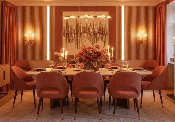
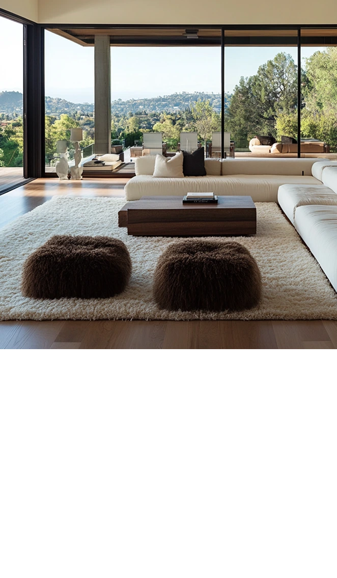
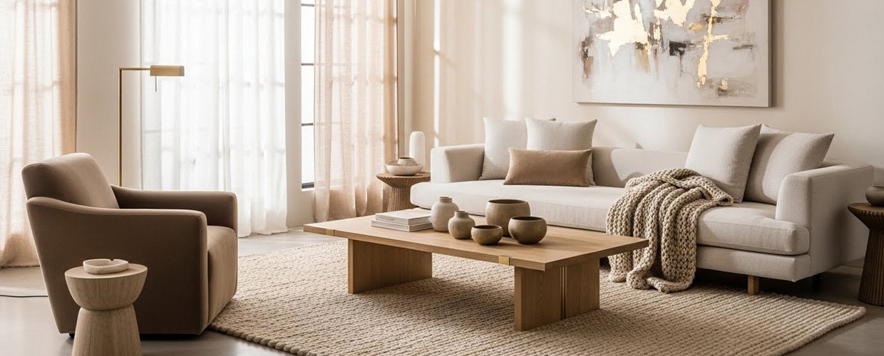
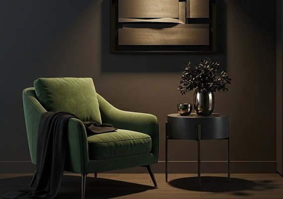
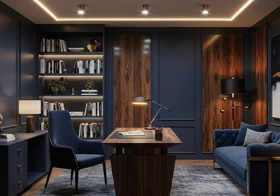
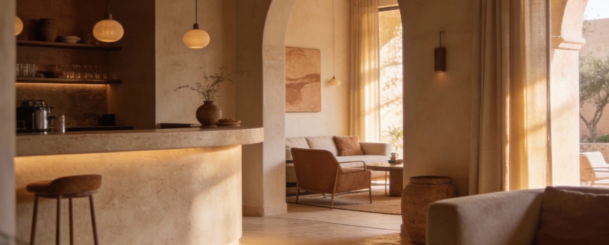
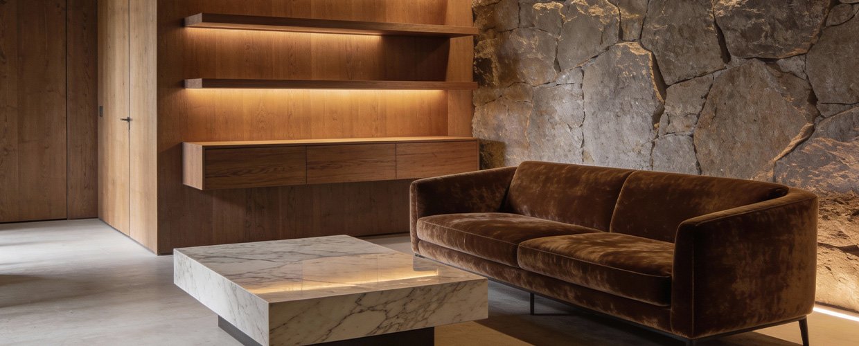
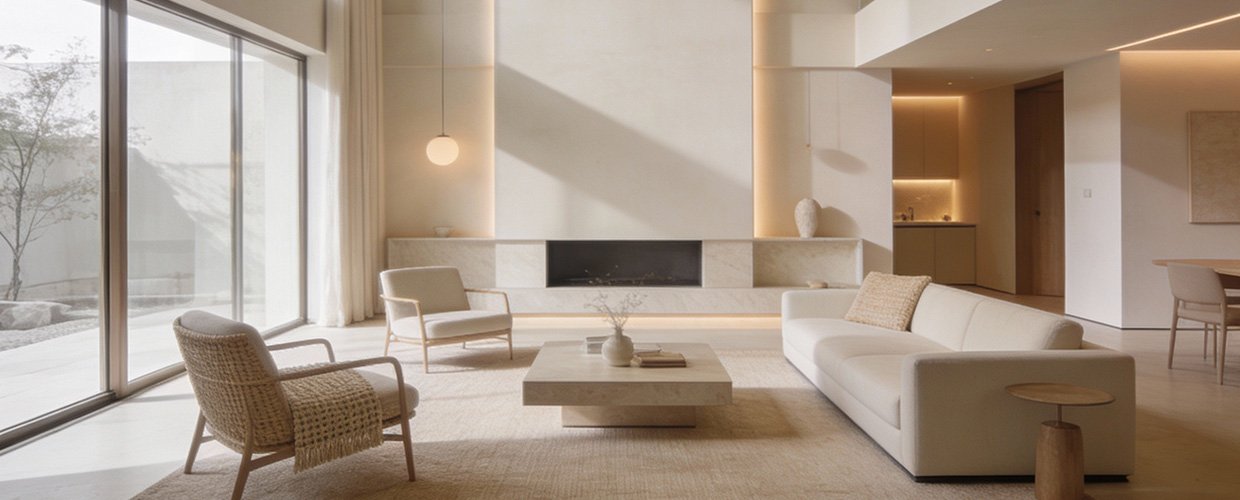
Color psychology is an essential consideration in luxury interior design, where every detail is curated to reflect sophistication and exclusivity. The use of color in these spaces goes beyond mere aesthetics; it is a strategic tool that can manipulate mood and behavior. For instance, neutral tones such as beige, taupe, and soft grays are often favored in luxury spaces for their timeless appeal and ability to create a serene and harmonious environment. These colors serve as a perfect backdrop for showcasing art pieces or luxurious furnishings, allowing the space to breathe while maintaining an air of understated elegance. On the other hand, bold and vibrant colors like emerald green or royal blue can introduce a sense of drama and opulence, making a striking statement without overwhelming the senses. These hues can be used sparingly, perhaps in accent walls or plush textiles, to add depth and interest to a room. Additionally, the psychological impact of color extends to the perception of space itself. Light colors can make a room feel larger and more open, which is particularly beneficial in urban luxury apartments where space may be at a premium. Conversely, dark colors can create a cozy, intimate atmosphere, ideal for private retreats or reading nooks. Understanding these dynamics allows designers to craft spaces that not only meet the aesthetic desires of their clients but also cater to their emotional and psychological needs. At AB Concepts, we believe that the thoughtful application of color is integral to creating luxury spaces that are not only visually stunning but also profoundly impactful on the well-being of those who inhabit them.
n conclusion, the use of color psychology in luxury spaces is a nuanced art that requires a deep understanding of both design principles and human psychology. The strategic application of color can transform a space from ordinary to extraordinary, influencing not just how it looks, but how it feels and functions. For homeowners and business owners seeking to create environments that are both luxurious and meaningful, the choice of color is crucial. By selecting shades that align with the desired mood and behavior, one can craft spaces that enhance daily living and reflect personal style. Key takeaways include the importance of considering the psychological effects of color when designing luxury spaces, the role of color in influencing mood and behavior, and the potential of color to alter perceptions of space. As you embark on your design journey, remember that color is not just a visual element but a powerful tool that can elevate the experience of a space. At AB Concepts, we are committed to helping you harness the power of color to create environments that are not only beautiful but also enriching and transformative. Whether you are drawn to the calming serenity of neutral tones or the bold vibrancy of jewel hues, understanding color psychology will enable you to make informed decisions that enhance both the aesthetic and emotional appeal of your luxury space.
TRENDING NOW
Curated Color Palettes for Boutique Hospitality Spaces
AB Concepts
Creating Rhythm in Interiors Through Repeated Color and Material Cues
AB Concepts