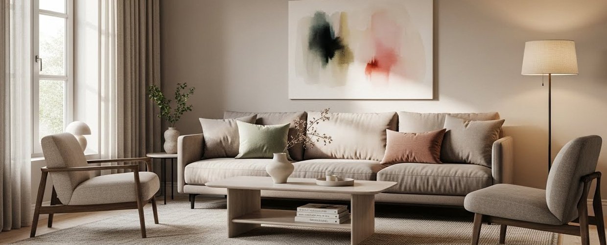
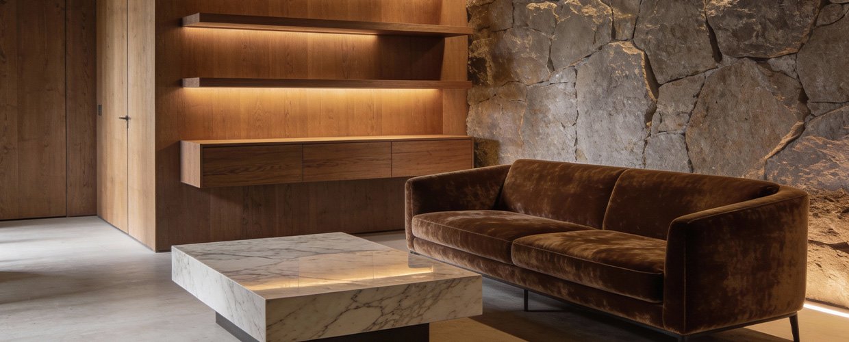
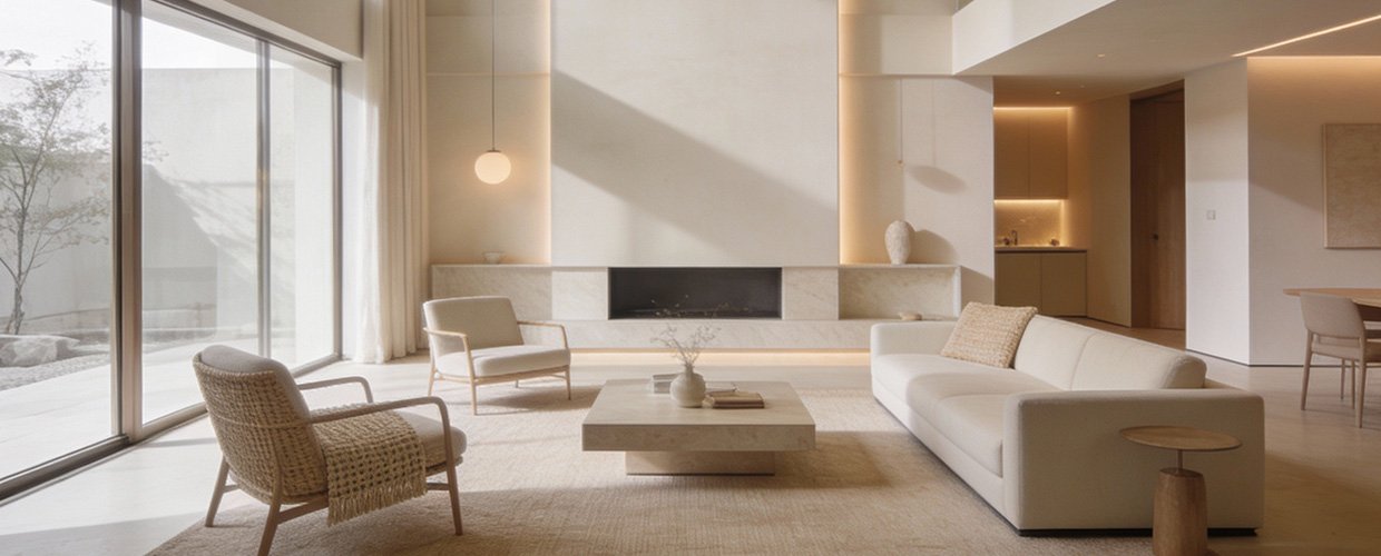
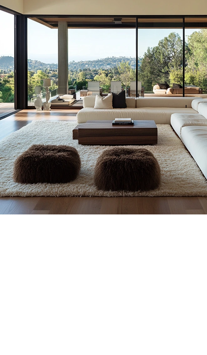
To effectively use accent colors in a neutral palette, it’s essential to start with a clear understanding of the role these colors will play in your design. Accent colors serve as focal points that draw the eye and add depth to a room without overwhelming it. The key is to choose colors that complement rather than clash with your existing neutral tones. Start by identifying a color that resonates with you or aligns with the mood you wish to create. For instance, a soft blue can evoke a sense of calmness, while a vibrant yellow might add energy and warmth. Once you’ve selected your accent color, consider how it will be distributed across the space. A popular method is the 60-30-10 rule, where 60% of the room is dominated by a base neutral color, 30% by a secondary neutral, and 10% by the accent color. This ensures that the accent color enhances the design without overshadowing the neutrals. Additionally, think about the elements in which the accent color will be incorporated. This could be through decorative pillows, artwork, a statement piece of furniture, or even in smaller details like vases and books. The goal is to create a cohesive look where the accent color ties the room together, adding interest and personality. By thoughtfully selecting and placing accent colors, you can achieve a design that is both dynamic and harmonious, reflecting your personal style while preserving the timeless appeal of a neutral palette.