November 7, 2025
Designing with Contrast: How to Balance Warm and Cool Tones
In the world of interior design, the art of balancing warm and cool tones is a fundamental skill that can transform a space from ordinary to extraordinary. At AB Concepts, we understand that color is not just a visual element; it is an emotional experience that can influence mood, perception, and even behavior. The strategic use of warm and cool tones can create a harmonious environment that feels both dynamic and serene. This balance is particularly relevant for our design-conscious clientele who seek spaces that are not only aesthetically pleasing but also deeply personal and timeless. Warm tones, such as reds, oranges, and yellows, are known for their ability to evoke feelings of comfort and warmth. They can make a space feel inviting and cozy. On the other hand, cool tones like blues, greens, and purples are often associated with calmness and tranquility, offering a sense of peace and relaxation. The challenge lies in blending these contrasting tones in a way that they complement rather than compete with each other. This article delves into the nuances of designing with contrast, offering insights and strategies on how to effectively balance warm and cool tones in your interior spaces. By understanding the psychological impact of colors and using them strategically, you can create environments that are not only visually stunning but also emotionally resonant. Join us as we explore the sophisticated interplay of colors and discover how to craft spaces that feel both vibrant and balanced.
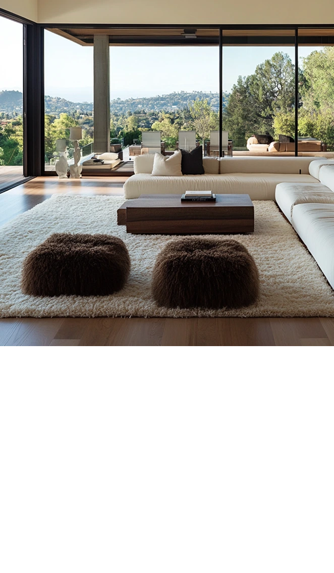
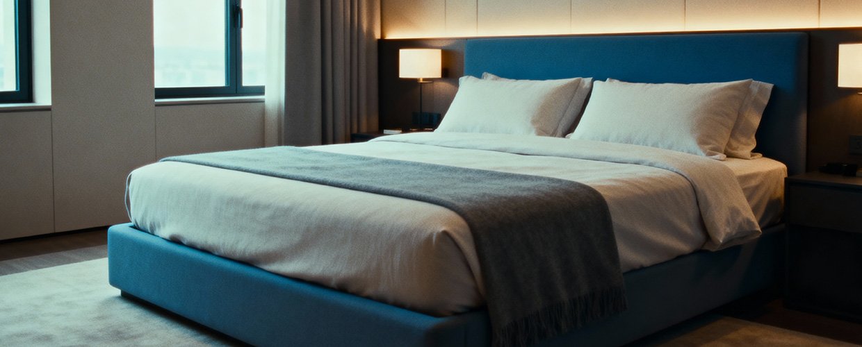
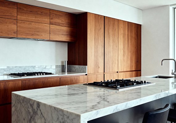
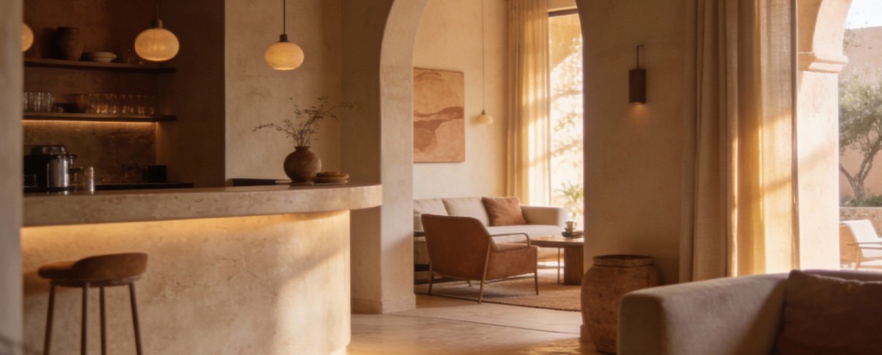
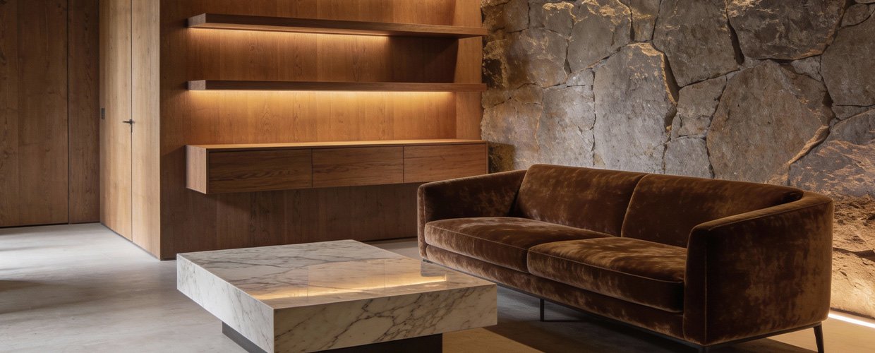
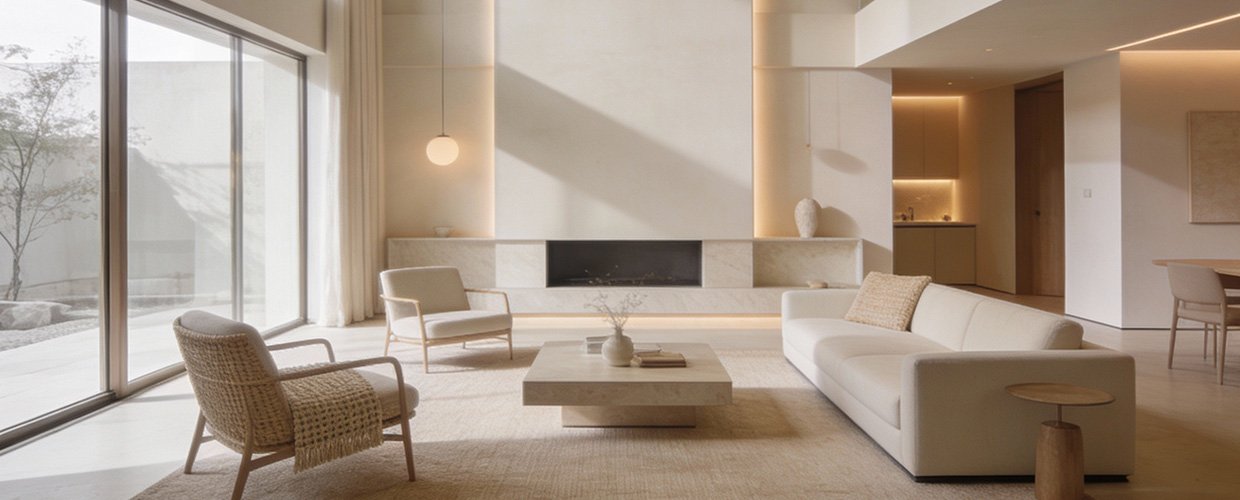
The first step in mastering the art of contrast in interior design is understanding the color wheel and the relationships between different hues. Warm tones, which include shades like red, orange, and yellow, are found on one side of the color wheel, while cool tones, including blue, green, and purple, occupy the opposite side. This natural opposition is what makes them complementary when used correctly. One effective strategy is to use warm tones as accent colors against a backdrop of cool tones, or vice versa, to create a focal point in the room. For instance, a living room with cool-toned walls can be invigorated with warm-colored cushions, rugs, or artwork. This not only draws the eye but also adds depth and dimension to the space. Another approach is to consider the lighting in the room, as it can significantly affect how colors are perceived. Natural light tends to enhance cool tones, making them appear more vibrant, while artificial lighting can warm up cool colors or intensify warm tones. Thus, the choice of lighting should be an integral part of your color strategy. Additionally, the texture of materials can also influence the perception of color. Glossy surfaces can make colors appear brighter, while matte finishes can tone them down. By experimenting with different textures, you can subtly adjust the balance between warm and cool tones. Ultimately, the goal is to achieve a harmonious blend that reflects your personal style and the intended mood of the space. At AB Concepts, we believe that the key to successful design lies in the details, and understanding how to manipulate color contrast is a powerful tool in creating bespoke interiors.
In conclusion, designing with contrast by balancing warm and cool tones is a sophisticated approach that can elevate any interior space. It requires a keen eye for detail and an understanding of the psychological effects of color. Key takeaways include the importance of using the color wheel as a guide, strategically placing warm tones as accents in cool-toned environments, and considering the impact of lighting and texture on color perception. These elements work together to create a cohesive and harmonious design that feels both timeless and personal. For design-conscious homeowners and boutique commercial clients, mastering this balance can transform spaces into havens of style and comfort. At AB Concepts, we invite you to start a conversation with us to explore how we can help you achieve the perfect balance of warm and cool tones in your space, crafting environments that resonate with your unique vision and lifestyle. Whether you’re renovating a single room or designing an entire home, understanding the interplay of colors is essential for creating a space that truly speaks to you.
TRENDING NOW
Curated Color Palettes for Boutique Hospitality Spaces
AB Concepts
Creating Rhythm in Interiors Through Repeated Color and Material Cues
AB Concepts