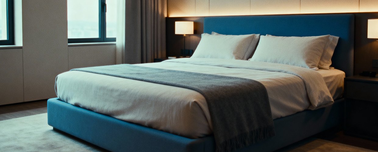
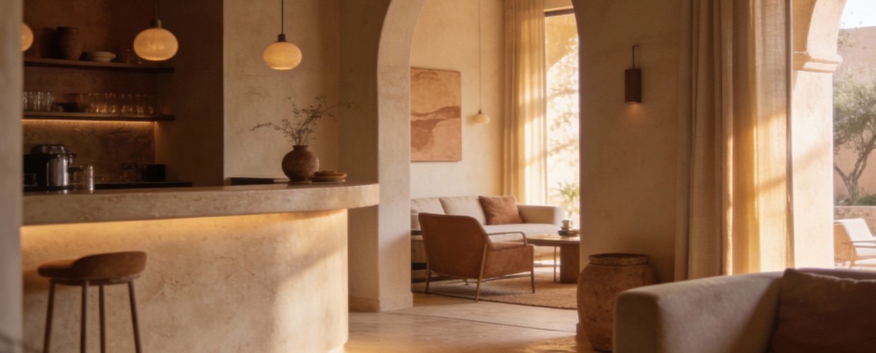
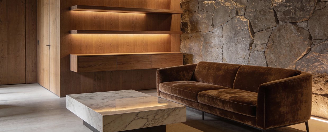
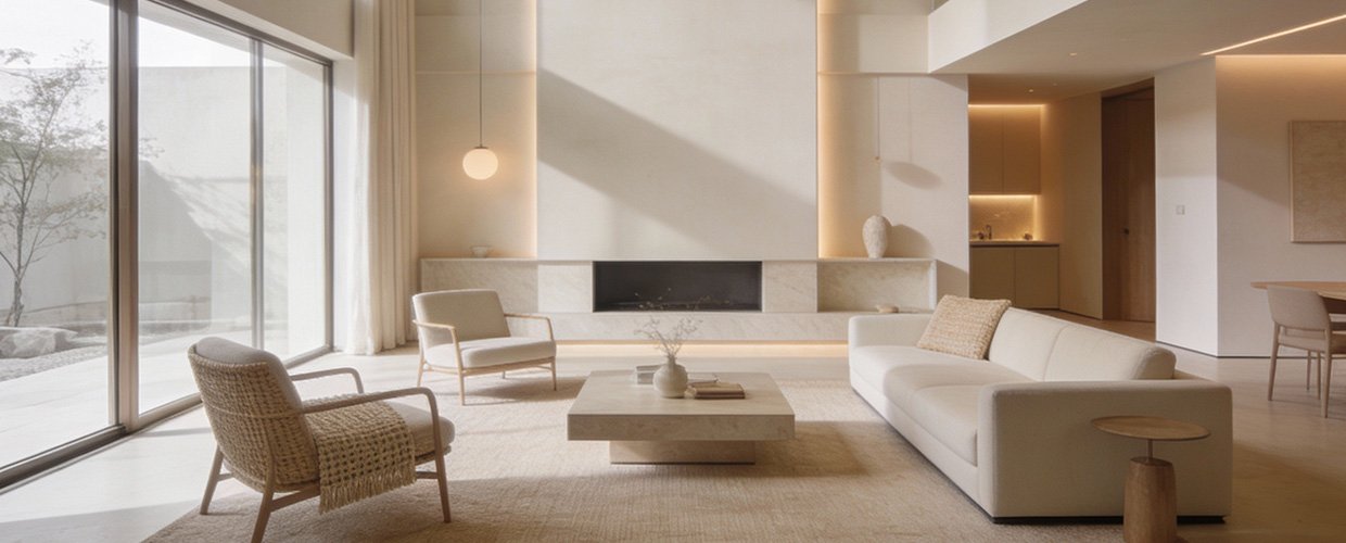
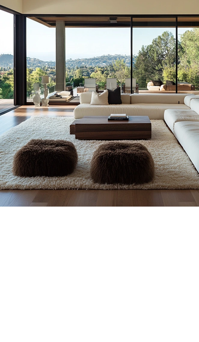
The first step in mastering the art of contrast in interior design is understanding the color wheel and the relationships between different hues. Warm tones, which include shades like red, orange, and yellow, are found on one side of the color wheel, while cool tones, including blue, green, and purple, occupy the opposite side. This natural opposition is what makes them complementary when used correctly. One effective strategy is to use warm tones as accent colors against a backdrop of cool tones, or vice versa, to create a focal point in the room. For instance, a living room with cool-toned walls can be invigorated with warm-colored cushions, rugs, or artwork. This not only draws the eye but also adds depth and dimension to the space. Another approach is to consider the lighting in the room, as it can significantly affect how colors are perceived. Natural light tends to enhance cool tones, making them appear more vibrant, while artificial lighting can warm up cool colors or intensify warm tones. Thus, the choice of lighting should be an integral part of your color strategy. Additionally, the texture of materials can also influence the perception of color. Glossy surfaces can make colors appear brighter, while matte finishes can tone them down. By experimenting with different textures, you can subtly adjust the balance between warm and cool tones. Ultimately, the goal is to achieve a harmonious blend that reflects your personal style and the intended mood of the space. At AB Concepts, we believe that the key to successful design lies in the details, and understanding how to manipulate color contrast is a powerful tool in creating bespoke interiors.