Curated Color Palettes for Boutique Hospitality Spaces
In the realm of boutique hospitality design, the art of curating color palettes transcends mere aesthetics, weaving a narrative that speaks to the soul of the space. At AB Concepts, we understand that color is not just a visual element but an emotive language that communicates the essence of a brand’s identity and the atmosphere of its environment. Crafting a curated color palette for boutique hospitality spaces involves a sophisticated interplay of hues, tones, and textures that elevate the guest experience and create a sense of place that is both memorable and timeless. The importance of this practice lies in its ability to transform a space into a destination, where every shade and tint is meticulously chosen to evoke emotions, tell stories, and enhance the sensory experience. As we delve into the world of curated color palettes, we explore how these carefully selected combinations can influence mood, highlight architectural features, and complement the materiality of a space. By considering factors such as lighting, cultural context, and the intended guest experience, designers can create environments that resonate deeply with their audience. This exploration not only highlights the aesthetic value of color but also emphasizes its role in crafting spaces that are deeply personal and reflective of a brand’s narrative. Join us as we unravel the nuances of color in luxury hospitality design, where every choice is deliberate, and every hue is a stroke in the poetry of space.
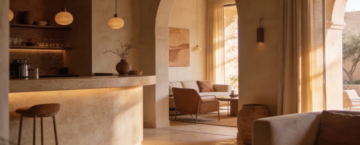
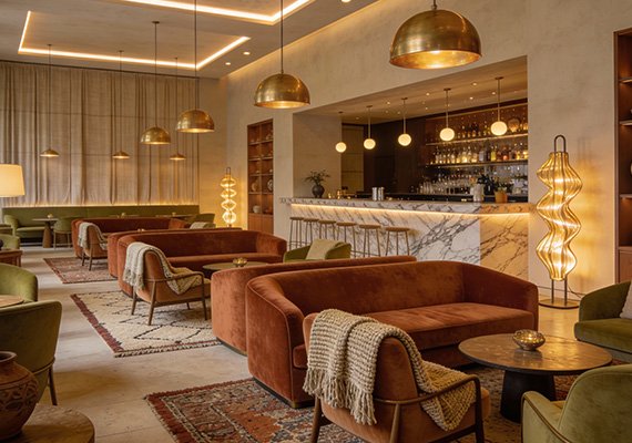
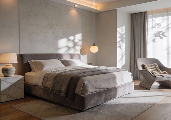
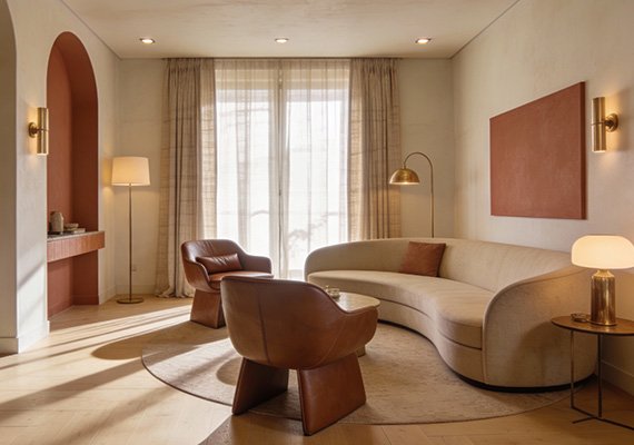
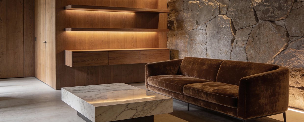
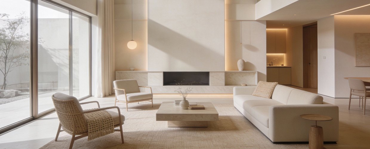
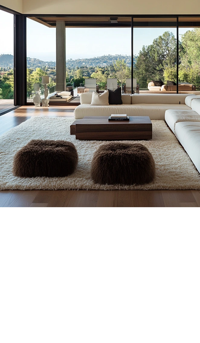
The process of developing curated color palettes for boutique hospitality spaces is both an art and a science, requiring a keen understanding of color theory, cultural symbolism, and psychological impact. At AB Concepts, we approach this process with a narrative-driven mindset, where each color is selected to enhance the story being told within the space. For instance, a coastal boutique hotel might employ a palette of soft blues, sandy beiges, and crisp whites to evoke the tranquility and elegance of the seaside, while a city-centric boutique might opt for rich jewel tones and metallic accents to reflect urban sophistication and vibrancy. The choice of colors is also influenced by the architectural elements and materials present in the space. Natural stone, wood, and metal can be complemented or contrasted with color to highlight their textures and create visual harmony. Moreover, lighting plays a crucial role in how colors are perceived, with natural and artificial light altering hues throughout the day. Designers must consider these variations to ensure the color palette remains consistent and effective under different lighting conditions. Additionally, understanding the target audience’s preferences and expectations is essential in creating a color scheme that resonates with guests and enhances their experience. By integrating these elements, designers can craft spaces that not only captivate visually but also engage guests on a deeper, emotional level, creating a lasting impression that aligns with the brand’s ethos and elevates everyday living.
In conclusion, the art of curating color palettes for boutique hospitality spaces is a sophisticated endeavor that requires a deep understanding of color’s impact on mood, perception, and experience. At AB Concepts, we believe that color is a powerful tool for storytelling, capable of transforming spaces into immersive environments that reflect a brand’s identity and enhance the guest journey. Key takeaways from this exploration include the importance of considering the interplay between color, light, and materiality, as well as the cultural and psychological implications of color choices. By approaching color selection with a narrative-driven focus, designers can create spaces that are not only aesthetically pleasing but also emotionally resonant, offering guests a unique and memorable experience. As we continue to explore the possibilities of color in luxury hospitality design, we invite you to consider how your own spaces can benefit from a thoughtful and curated approach to color. Whether through subtle, harmonious tones or bold, contrasting hues, the right color palette can elevate a space from the ordinary to the extraordinary, crafting environments that are both timeless and deeply personal, in line with our brand’s commitment to the poetry of space.
TRENDING NOW
Curated Color Palettes for Boutique Hospitality Spaces