January 16, 2026
Beyond White Walls: Exploring Innovative Neutral Color Strategies
In the realm of luxury hospitality and residential design, the use of color transcends mere aesthetic appeal; it becomes a narrative, a sensory experience that defines the essence of a space. Traditionally, white walls have been the canvas upon which designers paint their visions. However, the modern luxury landscape demands more than just simplicity—it craves innovation, depth, and a story told through color. This is where neutral color strategies come into play, offering a sophisticated palette that goes beyond the conventional. Neutrals are not just about beige or grey; they are about creating a backdrop that enhances material storytelling and the poetry of space. By incorporating subtle shades and textures, designers can evoke emotion, highlight architectural elements, and craft environments that are both timeless and deeply personal. This exploration into innovative neutral color strategies opens a dialogue about the relationship between space, atmosphere, and human experience—a core tenet of AB Concepts. As we delve into this topic, we will uncover how these strategies can transform spaces into sensory-driven sanctuaries that elevate everyday living. From the gentle warmth of taupe to the understated elegance of soft greys, each hue plays a critical role in shaping the narrative of luxury interiors. This article will guide you through the nuances of these strategies, offering insights into how they can be applied to create environments that resonate with sophistication and timelessness.
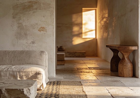
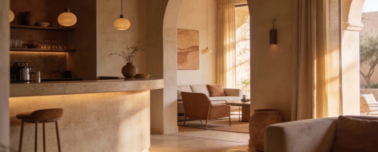
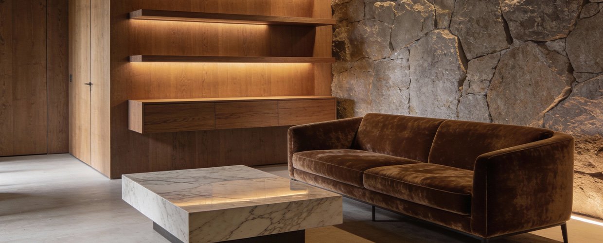
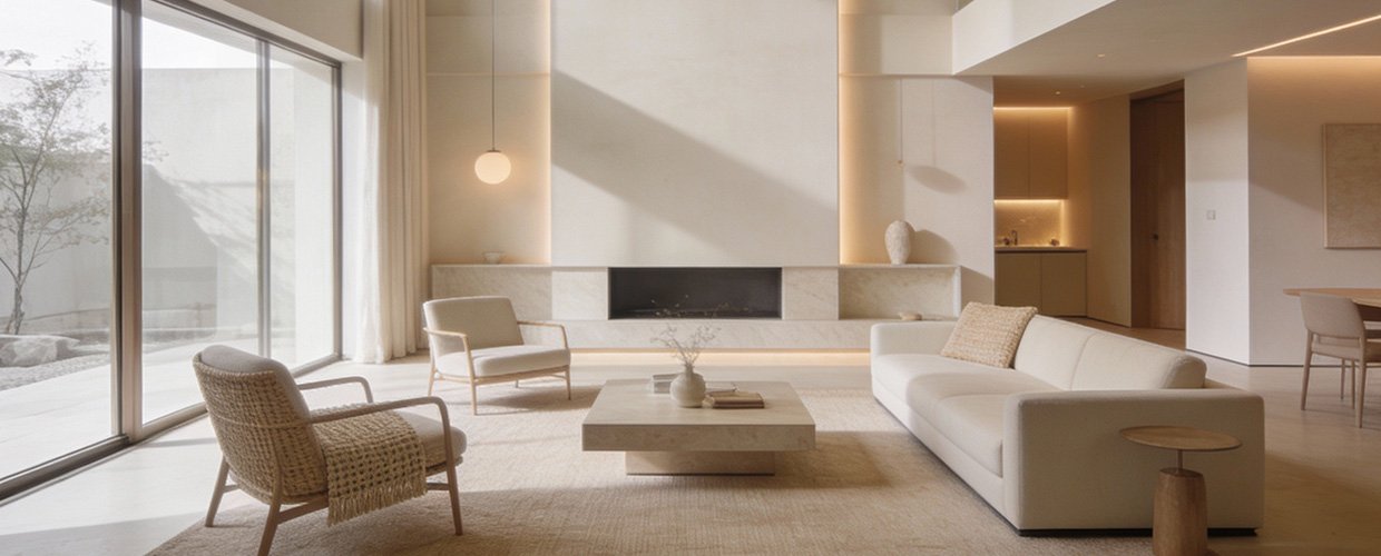
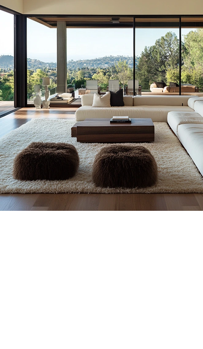
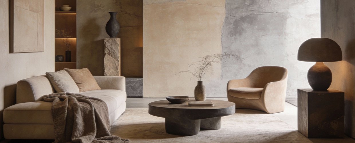
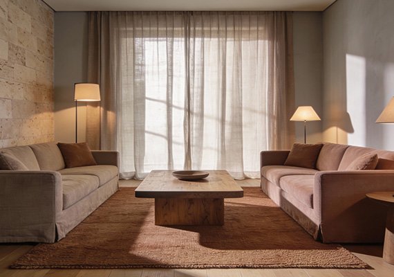
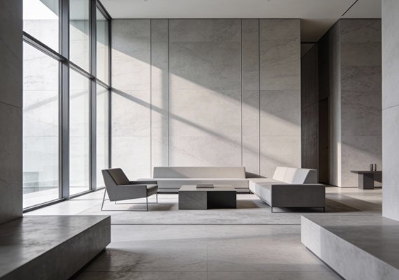
The artistry of using neutral colors lies in their ability to adapt and enhance the intrinsic qualities of a space. Unlike bold colors that demand attention, neutrals whisper sophistication and invite a closer look at the textures and materials within a room. In luxury hospitality and residential design, this subtlety is key. Neutrals such as greige, taupe, and soft charcoal provide a versatile foundation that complements a wide range of materials from rich woods to polished metals. These colors are not just passive backdrops; they actively participate in the design dialogue, allowing for a seamless integration of light and shadow, which in turn enhances the spatial experience. For instance, a room bathed in natural light can be transformed with the use of a soft, warm neutral that captures the changing hues of the day, creating a dynamic and evolving atmosphere. In the context of boutique hospitality design, where every element must tell a story, neutrals offer a canvas that supports the narrative without overpowering it. They allow for the introduction of bold artworks, intricate textiles, and statement furniture pieces that can be appreciated in their full glory. Moreover, neutral color strategies are inherently timeless, ensuring that spaces remain relevant and stylish, transcending fleeting trends. This timelessness is a hallmark of AB Concepts, where the aim is to craft environments that are as enduring as they are beautiful. Through the thoughtful application of innovative neutral color strategies, designers can create spaces that are not only visually stunning but also deeply engaging and personal.
As we conclude our exploration of innovative neutral color strategies, it is clear that these hues offer more than just a backdrop—they are integral to the storytelling of a space. By moving beyond white walls, designers can craft environments that speak to the senses and elevate the human experience. Neutrals provide a sophisticated palette that enhances materiality and allows for the interplay of light, texture, and form. They are the unsung heroes of design, offering versatility and timelessness that few other color schemes can match. For those in the luxury hospitality and residential sectors, embracing these strategies means creating spaces that are not only aesthetically pleasing but also deeply personal and engaging. The key is to view neutrals not as a lack of color, but as a rich tapestry of possibilities that can transform any space into a sanctuary of elegance and tranquility. As you consider the next steps in your design journey, remember that the poetry of space lies in its ability to tell a story—one that is crafted through thoughtful color choices and an understanding of the profound impact they have on our perception of space. By integrating innovative neutral color strategies, you can ensure that your designs remain at the forefront of luxury and sophistication, resonating with those who seek environments that are as timeless as they are beautiful.
TRENDING NOW