The Rise of Nature-Inspired Color Palettes in Modern Design
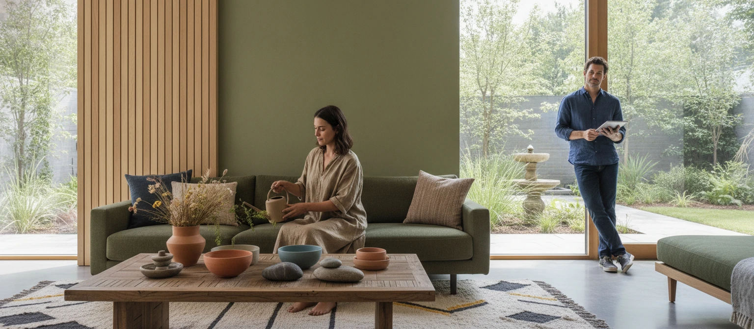
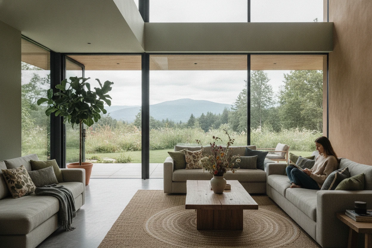
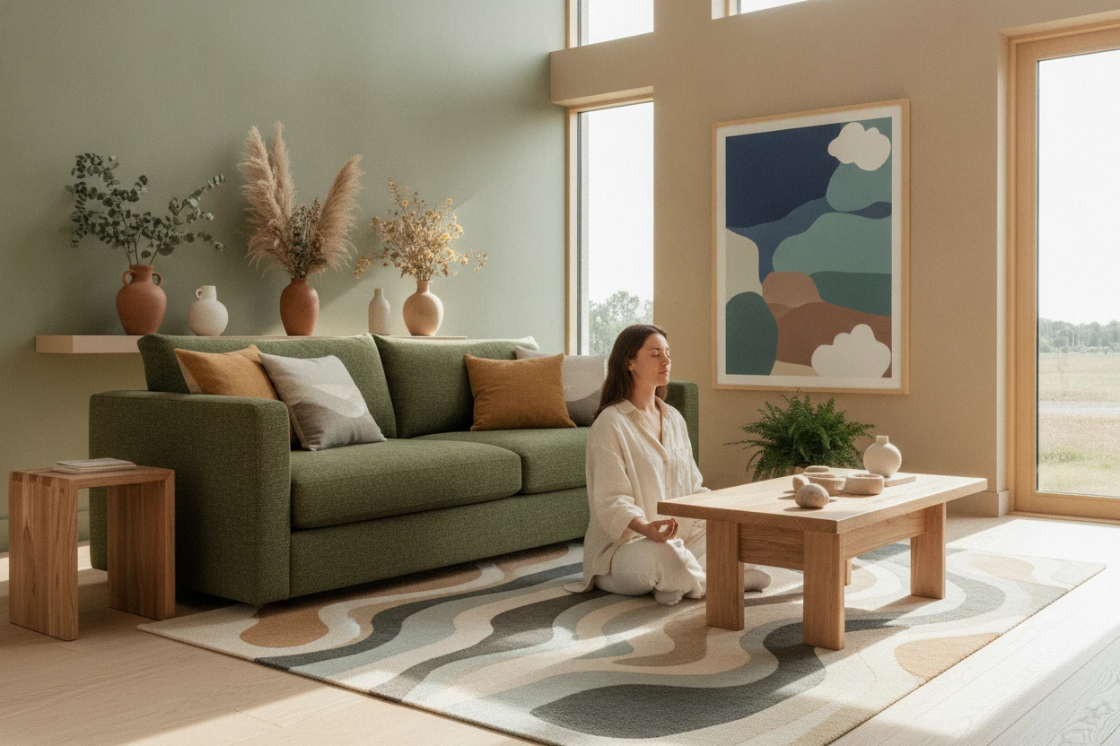
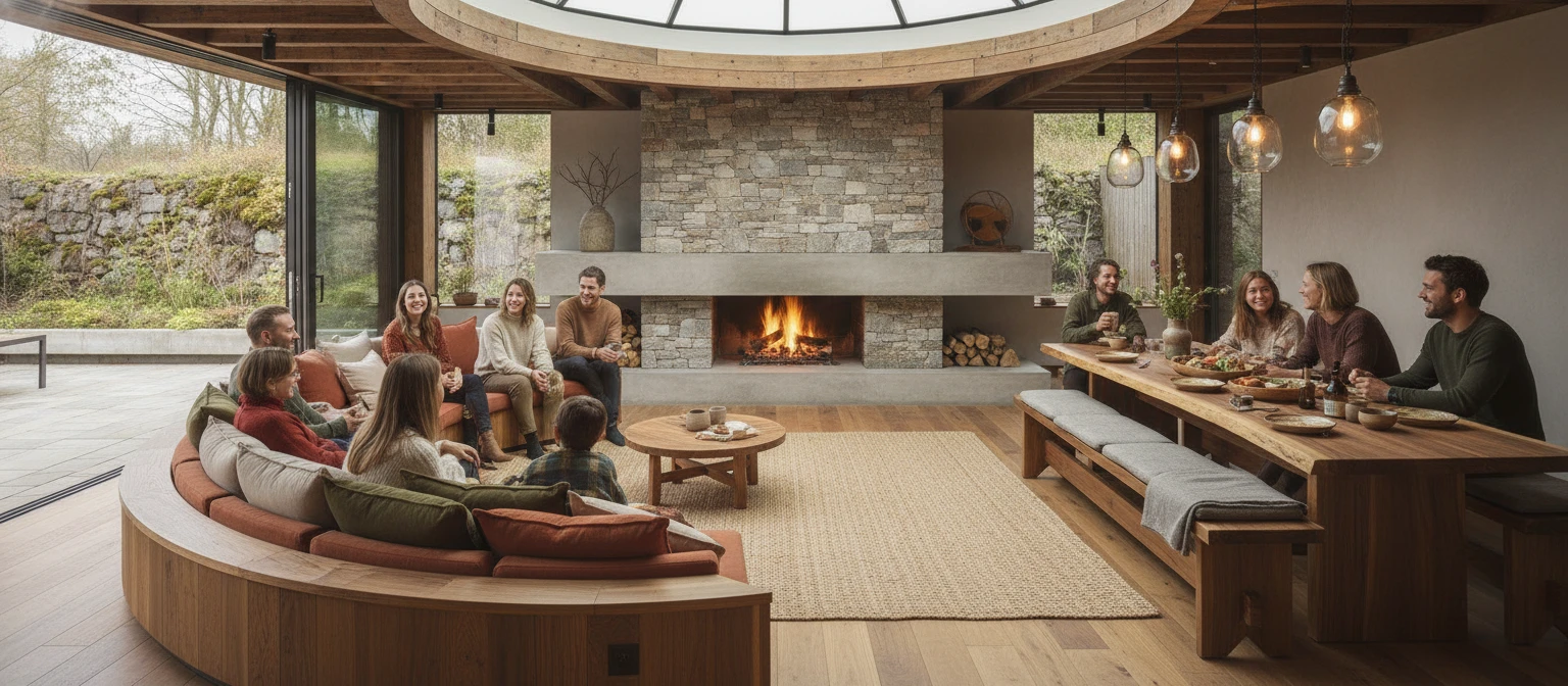
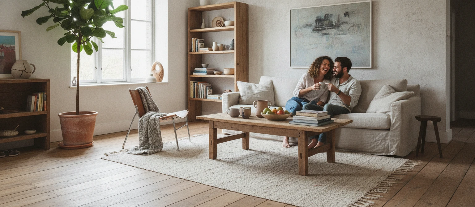
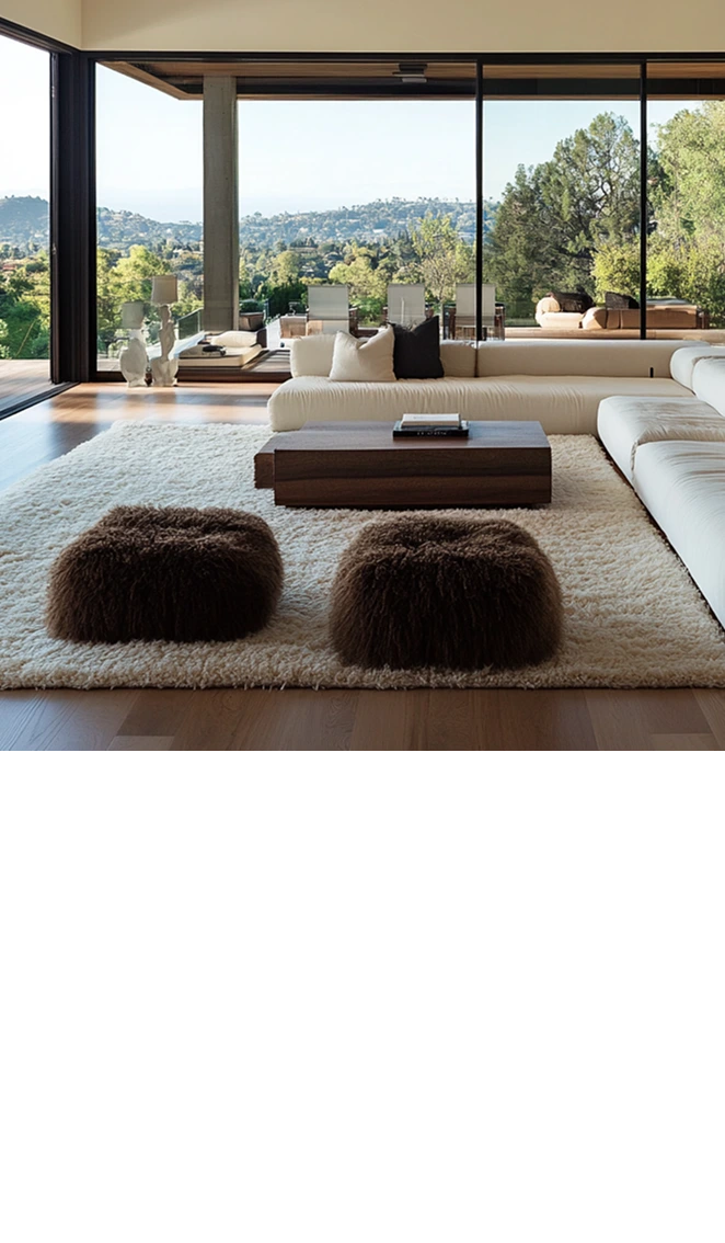
The rise of nature-inspired color palettes in modern design reflects a significant shift in how we perceive and integrate the world around us. As environmental consciousness grows, designers and architects are increasingly looking to nature for inspiration, seeking to create spaces and products that resonate with the natural environment. This trend is not just about aesthetics; it’s deeply rooted in the psychological and emotional responses colors evoke in individuals. Earthy tones like greens, browns, and blues have become synonymous with tranquility, balance, and harmony, appealing to a collective desire for connection with nature. Moreover, these palettes promote sustainability, aligning with a broader movement towards environmentally friendly practices in various design disciplines. Whether in interior design, architecture, or graphic design, the infusion of these colors serves to create inviting and calming atmospheres that reflect the beauty of the natural world. As the movement gains momentum, it emphasizes the importance of integrating natural elements into our everyday environments, influencing everything from product packaging to urban landscaping. By understanding the impact of color on human psychology and the environment, designers can craft spaces that not only look beautiful but also enhance well-being and promote a sustainable lifestyle.
In-depth analysis reveals that the rise of nature-inspired color palettes is closely tied to a growing awareness of sustainability and wellness. Designers are leveraging colors found in nature, such as the soft beige of sandy beaches, the deep greens of lush forests, and the serene blues of open skies, to evoke a sense of peace and well-being. For example, brands like Pantone have recognized this trend by incorporating earthy tones into their annual color forecasts, indicating a societal shift towards embracing these calming hues. Furthermore, the use of natural colors can significantly affect consumer behavior, promoting feelings of trust and reliability. In interior design, the application of these palettes can transform spaces, making them feel more welcoming and connected to the environment. Companies are now incorporating biophilic design principles, which emphasize the human-nature connection, into their projects, fostering environments that not only look visually appealing but also enhance mental health and productivity. Spaces designed with nature-inspired colors often encourage relaxation and creativity, making them ideal for workspaces, homes, and public areas. As this trend continues to evolve, we can expect more innovative uses of color that reflect our desire for sustainability, wellness, and a deeper connection to the natural world.
In conclusion, the rise of nature-inspired color palettes in modern design signifies an important evolution in how we approach aesthetics, sustainability, and emotional well-being. By embracing colors that reflect the beauty of the natural world, designers are not only creating visually stunning spaces but also promoting a healthier lifestyle and environmental consciousness. As we move forward, it will be crucial for designers to consider the psychological impacts of their color choices and to integrate sustainable practices that resonate with consumers. The incorporation of these palettes serves as a reminder of our connection to nature and the importance of creating environments that foster harmony and balance. Looking ahead, we may see even more innovative applications of nature-inspired colors across various design fields, encouraging a collective shift towards sustainable and mindful living as we continue to draw inspiration from the world around us.
TRENDING NOW
How Texture and Color Work Together to Shape Human Experience